Histogram: Definition, Examples and Synonyms
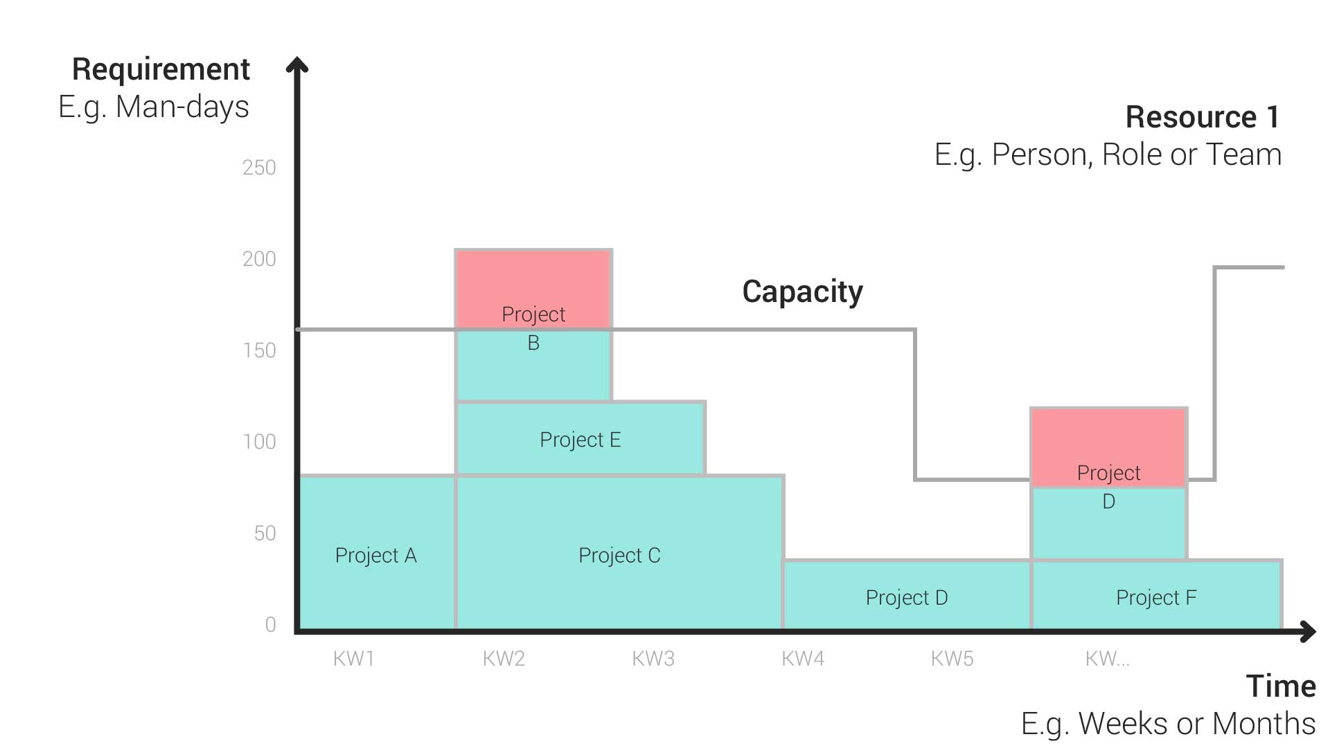
Histograms are a valuable tool in both traditional and Agile project managementProject ManagementProject management is the planning, steering, and monitoring of projects to achieve specific objectives within a given timeframe and budget. processes and provide a visual representation of project requirements and available resourcesResourceResources are all the people, places and things that you need to complete projects. The most important resource? Employees, of course!. They consist of an x-axis, a y-axis and vertical bars that represent your data.
The Axes of a Histogram
Time Axis (X-Axis)
The time values on this axis start on the left and flow to the right. The level of detail (individual days, weeks or months) depends on the intended purpose and granularity of the resource managementResource ManagementWhen it comes to resource management, the focus is on the optimal planning, coordination and monitoring of resources. The term “resources” includes things like employees, budgets, materials and time.. For example, weekly segments would be useful to show data about vacations and training – in this case, monthly segments would be too broad.
Demand Axis (Y-Axis)
This vertical axis shows demand, which could be expressed in units such as person-days, FTEs or story points. It is necessary to convert all estimated efforts and capacities into the same unit for all teams and projectsProjectA project is a time-limited undertaking with defined objectives and resources that delivers unique results and often includes complex tasks. that need to be planned using the histogram. For example, Agile teams can convert estimated story points into person days for consistency and comparability.
A Practical Example
Let’s imagine you are a project manager in a medium-sized company that runs several projects at the same time. Your goal is to plan resources efficiently and avoid bottlenecks. It could look like this:
1. Project Overview
You have three ongoing IT projects: website redesign, app development and database migration. Each project requires different resources such as developers, testers and designers.
2. Resource Requirements
You create a histogram to visualize the need for resources over the next few months. The months (e.g., January, February, March) are shown on the x-axis. The y-axis shows the demand in .
3. Demand Mountain Range
You stack the needs of the three projects on top of each other. In January, the website redesign team needs 20 person days, the app development team needs 15 person days and the database migration team needs 10 person days. In February, their needs change.
4. Bottleneck Detection
You see that a bottleneck has appeared in March because all three projects have high demand at the same time. Since you created your histogram in a PPMPPMSynonym for → Project Portfolio ManagementProject portfolio management (PPM) is a process that seeks to select, prioritize, monitor and analyze a company’s projects. software such as Meisterplan, you can clearly see when resources are running low. The mountain of demand exceeds capacity and turns red.
5. Optimization
You can now take action to resolve the bottleneck.
– Prioritization: Move less urgent tasks to later months.
– Resource allocation: Allocate additional resources or reduce demand if possible.
6. Simulations
You can simulate different scenarios, such as what happens if a project is completed early or if a new project is added.
Synonyms and Abbreviations
We are currently not aware of any commonly used synonyms or abbreviations for the term histogram.
FAQ
In addition to the time and demand axes, the histogram is characterized above all by the “demand mountain.” This is a consolidated view of all resourceResourceResources are all the people, places and things that you need to complete projects. The most important resource? Employees, of course! allocationsAllocationAllocating describes the strategic process of identifying the correct resources for projects or individual tasks and assigning them accordingly.. Imagine looking at your colleague, Anna, in such a histogram:
All of the projectsProjectA project is a time-limited undertaking with defined objectives and resources that delivers unique results and often includes complex tasks. that Anna is assigned to in a week are stacked on top of each other like a mountain. The height of the “project boxes” represents the demand per project. At the same time, the area of the projects is an indicator of the planned total effort for Anna.
The order in which the projects are arranged in the histogram is depends on priority and criticality. High priority projects that deliver the highest business value or strategy contribution are always at the bottom.
As part of resource planning, you probably use different forms of representation both to compare personnel availabilities and to keep an overview of several parallel projects and programs. Histograms are particularly helpful here, and you can fully use their strengths to your advantage in resource planning and simulation.
This compact form of representation is used in both classic and Agile project approaches. It provides a clear overview of capacity and demand, which makes it particularly easy to identify bottlenecks or unused capacities.
If you have many parallel projects and want to compare them with your resource availability, or you need to simulate different planning scenariosScenarioIn project portfolio management (PPM), scenarios are potential ways that your portfolio can look, based on a set of well-defined assumptions and portfolio decisions. Scenario planning is used to forecast…, the histogram may be your best choice.
Histograms and bar charts are two different forms of representation in resource managementResource ManagementWhen it comes to resource management, the focus is on the optimal planning, coordination and monitoring of resources. The term “resources” includes things like employees, budgets, materials and time..
A histogram shows resource demand over time, while a bar chart simply shows categorized data. In resource management, we use histograms to monitor capacity and demand and to identify bottlenecks.
A bar chart, on the other hand, is used as a graphical representation to visualize data changes over a certain period of time. For example, the change in the “resource availability” metric over one year.
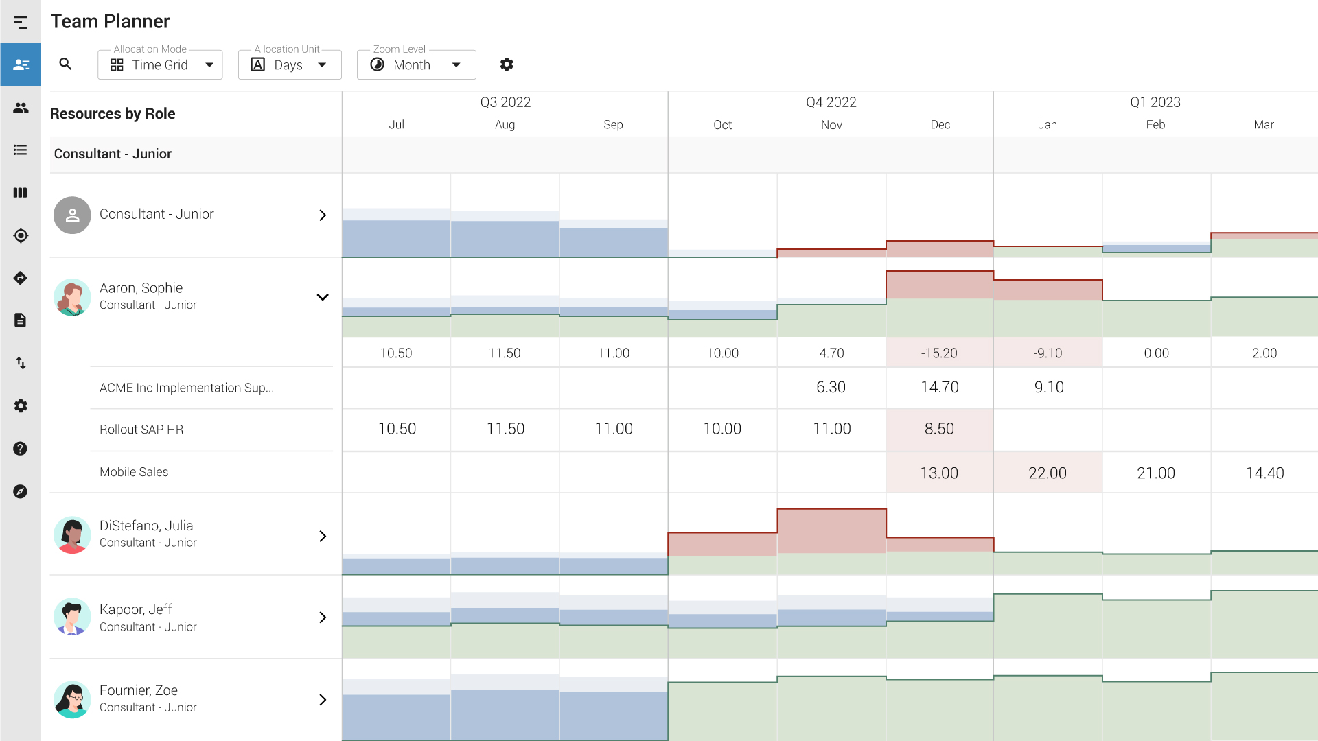
Histograms in Meisterplan
In Meisterplan, the histogram plays a central role in two views.
In the Portfolio Designer view, we combine the histogram with a Gantt chartGantt ChartSynonym for → GanttA Gantt chart is a categorical list on a vertical (Y) axis mapped against time on a horizontal (X) axis and is used to visualize tasks or project plans into… to show projectsProjectA project is a time-limited undertaking with defined objectives and resources that delivers unique results and often includes complex tasks. together with their associated resource utilization. If you change the values in one of the graphs, it affects the other one automatically and in real time. If you move a project in the Gantt chart, for example, the histogram automatically reacts to the change – so you not only can quickly identify bottlenecks, but also resolve them.
In the Team Planner, the histogram is the star of the show. Here, for example, team leads can concentrate fully on the workload of their employeesEmployeesSynonym for → ResourceResources are all the people, places and things that you need to complete projects. The most important resource? Employees, of course!.

This might also be of interest to you

Using Histograms to Get an Overview of your Resources
Histograms are used in traditional and agile project processes to obtain the necessary overview of capacities and requirements. Learn more about the compressed display format for resource management.

Is There a Formula for Resource Planning?
How much capacity do your employees actually have for project work? Learn how to plan projects realistically with a resource planning formula.

The Gantt Chart: Its Components, Uses and Benefits Explained
Learn what a Gantt chart is, why you should use it, understand its parts and see its applications in project and portfolio planning.