

Gantt charts have been a staple in project management for a long time, offering a visual representation of projectProjectA project is a time-limited undertaking with defined objectives and resources that delivers unique results and often includes complex tasks. timelines, tasks and dependencies.
Named after Henry GanttGanttA Gantt chart is a categorical list on a vertical (Y) axis mapped against time on a horizontal (X) axis and is used to visualize tasks or project plans into…, who pioneered their use in the early 20th century, these charts have become indispensable in modern project and portfolio planningPortfolio PlanningPortfolio planning is the process by which companies decide which projects they want to carry out. This ensures that projects are in line with the company’s objectives and that the….
But what information is needed to construct a Gantt chart effectively? And how can a project portfolio be modeled in such a chart?
After describing briefly what a Gantt chart is, we will cover its components, benefits, some improvements we at Meisterplan currently have in the works as well as some complementary and alternative charts to get additional insights beyond the world of Gantt.
What is a Gantt Chart?
A Gantt chartGantt ChartSynonym for → GanttA Gantt chart is a categorical list on a vertical (Y) axis mapped against time on a horizontal (X) axis and is used to visualize tasks or project plans into… is, in its simplest form, a list of projectsProjectA project is a time-limited undertaking with defined objectives and resources that delivers unique results and often includes complex tasks. along a vertical (Y) axis modelled against time on a horizontal (X) axis. It is a basic, two-dimensional visualization of the tasks or projects a team or organization is currently working on, as well as the tasks and projects planned for the future.
When assembled correctly and with care, your Gantt chart acts as
- an index or catalogue for PMOsPMOsSynonym for → Project Management OfficeA Project Management Office (PMO) is a permanent organizational unit responsible for the centralized and coordinated management of all projects. and other decision-makers and
- a rough roadmapRoadmapA roadmap is a strategic overview of one or more projects, their progress, milestones, and objectives. of where things are going from here.

What Components are in a Gantt Chart?
There are 5 elements needed to construct a Gantt chartGantt ChartSynonym for → GanttA Gantt chart is a categorical list on a vertical (Y) axis mapped against time on a horizontal (X) axis and is used to visualize tasks or project plans into…:
1. Project List:
At the core of any Gantt chart lies the list. In project managementProject ManagementProject management is the planning, steering, and monitoring of projects to achieve specific objectives within a given timeframe and budget., this is just a list of tasksTasksSynonym for → ProjectA project is a time-limited undertaking with defined objectives and resources that delivers unique results and often includes complex tasks. that need to be done to complete a project. In portfolio management, this is a list of projects. Once you have an overview of your projects, you can describe in greater detail the characteristics of each project and the relationships between them.
2. Duration:
Estimating the duration of each project is paramount. Calculate how long you think it will take based on the resourcesResourceResources are all the people, places and things that you need to complete projects. The most important resource? Employees, of course! available. The length of time dictates the length of the project’s bar in the chart. Then determine the earliest possible date the project could be started once the necessary resources are available, and the final date before it absolutely must be delivered.
3. Milestones:
MilestonesMilestoneIn project portfolio management, a milestone marks an important point in a project’s progress that requires monitoring or decision-making. Milestones indicate project phases, marking the completion of objectives or the… are significant points in the project timeline, marking key achievements or deliverables. Incorporating milestones into the Gantt chart provides stakeholders with clear indicators of progress, tracks critical junctures and makes duration estimates more concrete. They are typically represented by hashmarks, points or, in the case of Meisterplan, diamonds within the project bar. Be sure to celebrate these with your team when they’re completed!
4. Dependencies:
Projects seldom exist in isolation; they often rely on or influence one another. Understanding their dependencies is fundamental for sequencing activities properly. Some projects can’t begin until others are complete (finish-to-start), while some may overlap (start-to-start, finish-to-finish). Identifying dependencies ensures smooth flow in the portfolio and can reduce bottlenecks. In a Gantt chart, these are typically represented by arrows linking the project bars to one another, sometimes at the milestone level.
5. Resource Allocation:
Projects cannot be completed without resources—whether human, financial or material. Resource allocationAllocationAllocating describes the strategic process of identifying the correct resources for projects or individual tasks and assigning them accordingly. ensures that the necessary support is available when required, preventing resource conflicts and optimizing efficiency. Although they are not directly visible in the chart, they are a critical component in determining the appearance of and relationships between the visual elements: how long a project bar is, when a follow-up project can be scheduled, etc.
The Point?
What is the point of bringing all of these elements together? It’s the ability to track portfolio progress.
Regularly updating the Gantt chartGantt ChartSynonym for → GanttA Gantt chart is a categorical list on a vertical (Y) axis mapped against time on a horizontal (X) axis and is used to visualize tasks or project plans into… with actual progress allows for comparison against planned schedules. In most programs, this progress tracking has to be intuited by project managers, who compare the current date to the number of tasksTasksSynonym for → ProjectA project is a time-limited undertaking with defined objectives and resources that delivers unique results and often includes complex tasks. that have been checked off or their “gut feeling” for progress based on what they’ve heard from team members. This can be misleading, though, and there are other measures that can be used to track progress, which we will take a look at in the next section.
Tracking progress enables project managers to identify deviations early, mitigate risks and take corrective actions promptly. It also fosters accountability and transparency within a team.
But What Makes This Chart So SignifiGantt?
The Gantt chartGantt ChartSynonym for → GanttA Gantt chart is a categorical list on a vertical (Y) axis mapped against time on a horizontal (X) axis and is used to visualize tasks or project plans into… has established itself as one of the more important tools in the kits of projectProjectA project is a time-limited undertaking with defined objectives and resources that delivers unique results and often includes complex tasks. and portfolio managers everywhere. But what about this two-dimensional cluster of bars on a timeline has made it so popular?
Those who use them regularly have probably told you already: it’s about ease and speed. The visual representation of project milestonesMilestoneIn project portfolio management, a milestone marks an important point in a project’s progress that requires monitoring or decision-making. Milestones indicate project phases, marking the completion of objectives or the… and dependencies makes it easy for stakeholders to discern the feasibility of ongoing projects, when they are likely to be completed and the relationship of any given project to others in the portfolio.
In other words, it’s about how current progress is likely to affect future progress. If you can see when current projects are likely to finish up, you can determine the feasibility of the current pace for the rest of your portfolio.
Gantts Give You More Time
With the ability to see this information at a glance, managers reduce the effort and cognitive load expended for evaluation. They are instead able to spend their time exploring alternatives and finding solutions to problems, whether they’re imminent or farther out on the horizon.
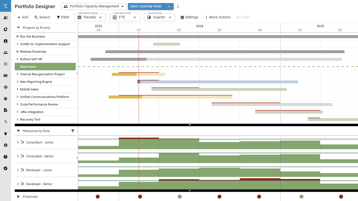
This descriptive power is why Meisterplan places the Gantt chart at the heart of its design. When you open the app for the first time, what else does the user see but a Gantt chart in the Portfolio Designer!
What is Gantt Good for? A Few Examples in Practice
I’ve described a chart and listed its parts. This isn’t a college statistics class, though, so let’s talk about how you can actually use this chart.
As with any chart or graph, it’s the chart’s axes and units that determine its function. As explained above, the Y axis is categorical and the X axis is temporal. This means that pretty much anything can be modeled in a Gantt chartGantt ChartSynonym for → GanttA Gantt chart is a categorical list on a vertical (Y) axis mapped against time on a horizontal (X) axis and is used to visualize tasks or project plans into… as long as you have a few different categories or “entities” that are expected to reach completion after a specified period of time.
ProjectProjectA project is a time-limited undertaking with defined objectives and resources that delivers unique results and often includes complex tasks. and portfolio management are, of course, the poster children advertising the effectiveness of Gantt charts. That being said, their portrayal tends to differ in a few key ways.
Project Management vs Portfolio Management
The first of these is scope. Gantt charts for project managementProject ManagementProject management is the planning, steering, and monitoring of projects to achieve specific objectives within a given timeframe and budget. are a bit more familiar. Projects are broken down into individual tasks, and these tasks are completed over the course of a two-week sprint. The Gantt chart is more granular in this case.
In the portfolio management context, a Gantt chart typically displays entire projects, which can be scheduled to last entire months if not quarters or years. As such, the Gantt chart takes a much wider view and is “zoomed out” in comparison.
The differing emphasis on task vs. project level also tends to affect the interdependence of the entities displayed in a Gantt chart. This is due, in large part, to the nature of the work. In the day-to-day, tasks often proceed in a linear fashion.
For example:
- I write this blog post,
- my colleagues proofread this blog post,
- I incorporate feedback from my colleagues,
- the blog post is constructed in WordPress,
- the blog post is published.
In the example above, each step is dependent on the previous — I cannot incorporate feedback until that feedback exists. When it comes to managing projects in a portfolio context, the relationships are more complex. Certain parts of Project A may be needed in Project B, even if Project A isn’t finished yet. These complex intra-portfolio relationships are something Meisterplan is built to navigate, and something that most task management software simply can’t handle.
But Can Gantt Do More?
A contemporary Gantt chartGantt ChartSynonym for → GanttA Gantt chart is a categorical list on a vertical (Y) axis mapped against time on a horizontal (X) axis and is used to visualize tasks or project plans into… provides just enough information without overwhelming you. What about situations where you need more information though? Sure, on the surface you see the milestonesMilestoneIn project portfolio management, a milestone marks an important point in a project’s progress that requires monitoring or decision-making. Milestones indicate project phases, marking the completion of objectives or the… and interconnectedness of your portfolio, but sometimes you really do need to see the trees and not just the forest.
For this reason, the Portfolio Designer view functions like an index. When you need to see more than just the bird’s-eye view, you can drill down and take a look at costs to date, employeeEmployeeSynonym for → ResourceResources are all the people, places and things that you need to complete projects. The most important resource? Employees, of course! time spent on the projectProjectA project is a time-limited undertaking with defined objectives and resources that delivers unique results and often includes complex tasks. and other project metrics.
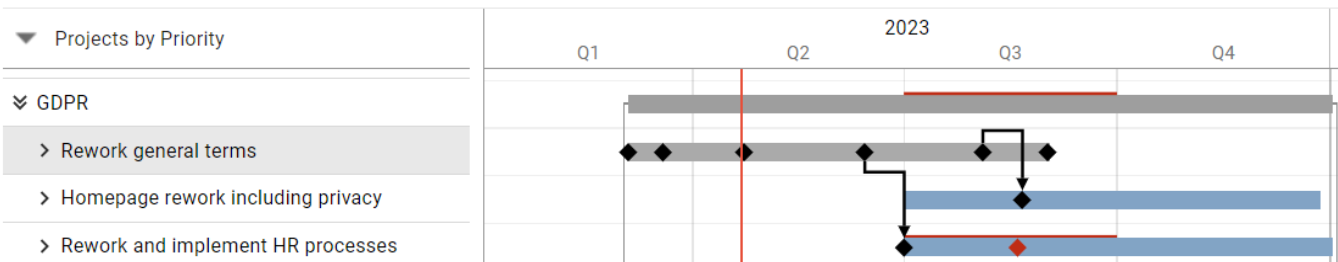
Having this data is helpful, but we asked ourselves if there was any way we could help users leverage this data automatically and at a glance in the Gantt chart. Now, Meisterplan allows users to use actual time worked as a proxy for project progress instead of relying on just a current date line or intuition. Take a look at the image below.
Let’s say for this project we estimate a total of 80 full time equivalent (FTEFTESynonym for → Full-Time EquivalentFull-time equivalents (FTEs) are a standardized unit of measurement in resource management representing the full-time capacity of a single worker.) hours needed for completion.
As team members log their hours and allocate them to a project in Meisterplan, the system uses it to automatically calculate the percentage completion against the time allotted in the plan (that being said, Meisterplan can also pull this data from other time-tracking software!). The bar gradually fills up with a solid color in the Gantt chart, allowing you to determine if you are ahead or behind schedule.
It’s a simple feature, but it’s one that the field of project management has been clamoring for since the 90s. We’re happy we can finally display progress via the proxy of time-tracking so our users can get more out of that single glance at their Gantt charts, but we don’t plan on stopping there.
There are other measurements that can be used as a proxy for progress-tracking, and we hope to make these available for display in the same way that actual time worked is, so stay tuned!

But What Can’t Gantt Do: A Few Complements
If your Gantt chartGantt ChartSynonym for → GanttA Gantt chart is a categorical list on a vertical (Y) axis mapped against time on a horizontal (X) axis and is used to visualize tasks or project plans into… is accurate, it likely means you have good underlying data, nice! If you find yourself running against the clock a good amount though, there are a couple other charts that can complement a Gantt chart or provide novel insights:
- RACI matrix:
A RACI matrix describes the nature of the relationship between person(s) or role(s) and a projectProjectA project is a time-limited undertaking with defined objectives and resources that delivers unique results and often includes complex tasks., namely who is Responsible, Accountable, to be Consulted and to be Informed. Focusing on these four questions can improve efficiency by identifying who’s needed, who’s not and who can be brought on board. Modeling this for specific project types ahead of time can make decisions about resourceResourceResources are all the people, places and things that you need to complete projects. The most important resource? Employees, of course! allocationAllocationAllocating describes the strategic process of identifying the correct resources for projects or individual tasks and assigning them accordingly. easier and help resolve bottlenecks in your Gantt chart. - Flow chart:
A flow chart breaks down the workflow of individual projects into their individual steps. Integrating this into your workflow can help provide more accurate time estimates for your Gantt chart!

- Critical path diagram:
A critical path diagram (CPD) is an important part of the critical path method, which is used for planning large, complex projects. It is essentially a more sophisticated version of a flow chart that focuses on dependencies between project steps and the most resource-intensive parts of a project. Modeling these complex dependencies in advance, before you get into the weeds of resource allocation and timing, makes it clear how certain projects are interrelated and which steps need to be prioritized. In its essence, this diagram can be a good first step before incorporating a workflow or series of projects into your Gantt chart.

- Control chart:
Shewhart control charts, also known simply as control charts, are an important tool for monitoring portfolio efficiency. It essentially sets an acceptable range of outcomes. Any values that fall outside of the pre-defined band of acceptable outcomes are flagged and analyzed to determine the cause. This ex-post evaluation can provide more accurate estimates for your Gantt chart, improving its accuracy in the future.
Conclusion
In conclusion, constructing a Gantt chartGantt ChartSynonym for → GanttA Gantt chart is a categorical list on a vertical (Y) axis mapped against time on a horizontal (X) axis and is used to visualize tasks or project plans into… necessitates careful consideration of various factors, including taskTaskSynonym for → ProjectA project is a time-limited undertaking with defined objectives and resources that delivers unique results and often includes complex tasks. lists, durations, dependencies, dates, resourcesResourceResources are all the people, places and things that you need to complete projects. The most important resource? Employees, of course!, milestonesMilestoneIn project portfolio management, a milestone marks an important point in a project’s progress that requires monitoring or decision-making. Milestones indicate project phases, marking the completion of objectives or the… and progress tracking. By including these elements, project managers can create comprehensive Gantt charts that serve as invaluable roadmapsRoadmapA roadmap is a strategic overview of one or more projects, their progress, milestones, and objectives. for project success.
Whether managing a small-scale endeavor or overseeing a complex venture, harnessing the power of Gantt charts, and using other tools to ensure its accuracy, empowers teams to navigate the intricacies of project managementProject ManagementProject management is the planning, steering, and monitoring of projects to achieve specific objectives within a given timeframe and budget. with clarity and precision.
Read Next
Connor Devine

Connor has worn a few different hats, from education to finance and now marketing. No matter the industry or the role, though, it's the ...

Everything You Need to Know about Project Portfolio Management (PPM)
Project portfolio management... what is it exactly? What do you need it for? And more importantly, how does it work? You can find out here!