A sports team may be great, but they wouldn’t be as successful without their MVP (most valuable player). Would the Bulls have won as many championships without Michael Jordan? Probably not. Similarly, managing project portfolios wouldn’t be as successful without Gantt charts, which have been the MVP of project portfolio management for over 100 years. Because of the importance of Gantt charts, project portfolio managers are loving how Meisterplan utilizes Gantt charts in their project planning. If you’ve ever managed many projects or portfolios at once, you’ve probably heard of or at least seen a Gantt chart. Gantt charts are a powerful tool for portfolio and task management used by professionals across a wide variety of industries. While now they are almost exclusively created and edited on computers, they were actually created long before computers and the internet.
What Is A Gantt Chart?
You likely know what a Gantt chart is, but just in case, here’s a quick explanation. Imagine you have 5 tasks to complete today. For each task, say you need the following amounts of time to complete each one:
- Task 1: 30 minutes
- Task 2: 1.5 hours
- Task 3: 1 hour
- Task 4: 2 hours
- Task 5: 1 hour
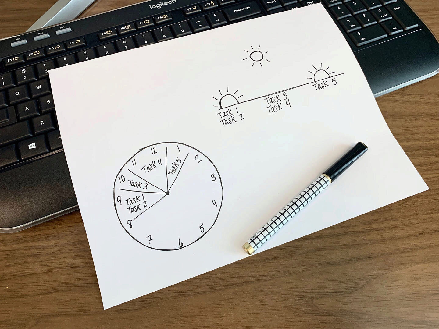
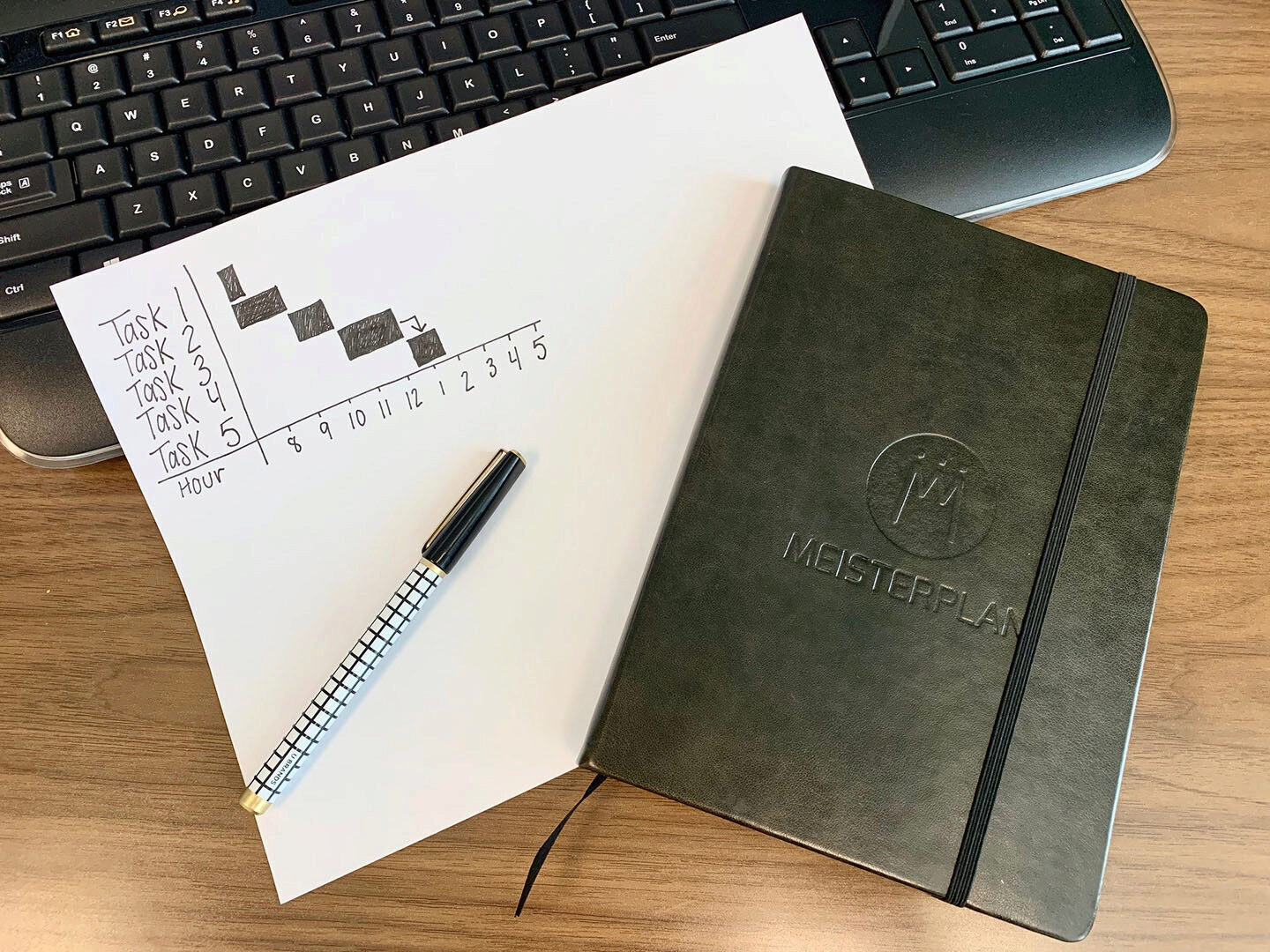
Additionally, Task 4 must be completed before you can complete Task 5 and Tasks 1 and 2 can be done at the same time. Now with this in mind, think about how you would outline your schedule for the day to get everything done in an efficient manner. If you have a couple of minutes, take out a piece of paper and sketch out how you would plan your tasks. There are many ways you could visually represent your schedule for these tasks. The project portfolio managers at Meisterplan did a quick sketch of what this schedule could look like as a Gantt chart.


As you can see, the tasks are outlined on the Y-axis (vertical) and length of time is on the X-axis (horizontal). The bars in the chart represent the time it will take to complete each task with an expected start and end time. You will notice we used an arrow between Tasks 4 and 5. This is to easily signify that Task 4 needs to be completed before Task 5. You can also see that Task 1 and Task 2 have a small bit of overlap because they can be done at the same time. Whether or not this is the first time you have seen a Gantt chart, or if you’ve seen hundreds, it’s easy to understand why they are favored by project portfolio managers. The visualization of projects and their dependencies are extremely clear and easy to discern.
How the Gantt Chart Got its Start
The earliest form of what we know as the Gantt chart was first designed in 1896 by Polish engineer, Karol Adamiecki, who called it a harmonogram. The harmonogram dramatically helped increase the output of metal rolling mills, machine shops, and other businesses by creating graphic solutions to production problems. The Gantt chart that we know and use today was created around 1910 by Henry Gantt, an American mechanical engineer and management consultant. His version of the harmonogram, called the Gantt chart, was a more visual representation than its predecessor.
The usefulness of Gantt charts became apparent right away, but there were some difficulties in its application. Although Gantt charts are relatively simple and easy to make, every project change required the chart to be redrawn. Because projects are constantly undergoing changes, the inability to change Gantt charts without completely redrawing them was a tedious setback. However, the problem of redrawing Gantt charts became obsolete with the rise of the computer.
In today’s digital world, Gantt charts are much more practical because they can be adapted with just a few clicks. Now, project portfolio managers can combine the visual benefits of Gantt charts with the ease of planning and adapting provided by computer software. Now that we’ve explained the perfect marriage of Gantt charts and modern technology, let’s look at the advantages this marriage can provide portfolio managers.
Understand Your Schedule Quickly and Easily
One major benefit of using a Gantt chart is visibility. Gantt charts make it easy to understand the schedules and deadlines of each project in your portfolio. The most important information is quickly and easily accessible and you can immediately see when timelines overlap and where potential resource conflicts will occur. By their very nature, Gantt charts are simple to understand. If that’s not the case, somebody has done something wrong!
Rule of Thumb:
Gantt charts must be easy to understand. If that’s not the case, somebody has done something wrong.
Gantt Charts Show Dependencies Between Projects
Look back at the Gantt chart we sketched out. It’s easy to interpret that the arrow from Task 4 to Task 5 indicates that Task 4 must be completed before Task 5 can start. Clearly understanding the interdependencies between projects is necessary for accurate planning. However, imagine you have many interdependent projects. Too many interdependencies could leave your Gantt chart difficult to understand and complex to read.This is why the Meisterplan project portfolio management software only shows you the dependencies between specific highlighted projects. Meisterplan will also alert you if you are attempting to start a project before a dependency to a previous project has been fulfilled.
Key Project Information At Your Fingertips
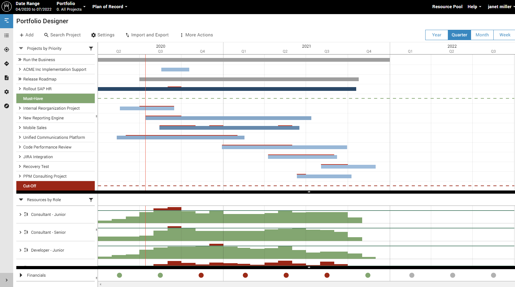
Not only can Gantt charts get you organized with your project scheduling, but they can also provide some additional insights into the individual projects themselves. Projects can be color-coded to display different types of key project information. For instance, they can be color-coded based on their strategic alignment or by who is assigned to the project. To further refine key project information, projects in Gantt charts can be organized based on project priority. All of this key project information is incredibly useful but can become tedious when entered manually.
At Meisterplan, we understand project portfolio managers need an accurate overview of projects, but they don’t have a lot of time to put into organizing Gantt charts. That’s why Meisterplan allow users to adjust the ranking of projects in the system with just a few clicks. Users can also easily assign different colors to projects based on a wide variety of properties, such as:
- Alignment with strategic objectives
- Business goal (e.g., run the business, change the business, grow the business)
- Risk level
- Status (e.g., critical, needs attention, not critical)
- Stage gate (e.g., idea, in approval, in execution, on hold)
- Project phases (e.g., planning, execution, completion)
- Workload saturation
- Role/resource allocations

Solve Problems Efficiently with Gantt Charts
When portfolio managers are juggling multiple or even dozens of projects, it’s extremely easy for bottlenecks and resource constraints to be buried beneath project data. With the use of Gantt charts, project portfolio managers can easily identify where problems in their portfolio are occurring so they can address these issues as quickly as possible. Meisterplan takes this concept further by allowing users to immediately see if a project doesn’t fit as it is currently planned with a noticeable red line above that project bar. Users can also see at a glance if there is a time period when there aren’t many projects scheduled.
When project portfolio managers can see an accurate schedule of projects, they can ensure projects are only scheduled when there is the capacity to support the project. Managers can also adjust the duration of projects to prevent bottlenecks or change the priority of a project so that it gets resources first. All of these changes are easy within Meisterplan which updates your Gantt charts in real-time so that users can focus on executing plans.
Gantt Charts Are Even Better With Meisterplan
Gantt charts are incredibly useful for project portfolio management and resource management, but they are even better with Meisterplan. Being able to maintain Gantt charts in Meisterplan allows project managers to see multiple aspects of projects, including priorities, resource availabilities, workloads, and project statuses among others all in one place. The visualization of projects makes it easy to pinpoint problems with project or resource schedules and solve them almost immediately with minimal effort. Meisterplan helps make the management of all these elements much more efficient and interactive to ultimately support effective PPM and resource management.
Read Next

Data Quality: The Achilles Heel of Project Portfolio Management


