

How long would it take for you to recognize if a specific employeeEmployeeSynonym for → ResourceResources are all the people, places and things that you need to complete projects. The most important resource? Employees, of course! was underallocated in April? Or how quickly could you determine which of your projectProjectA project is a time-limited undertaking with defined objectives and resources that delivers unique results and often includes complex tasks. teams have more work than capacity? These are important questions, but many organizations struggle to answer them swiftly or at all. With this in mind, Meisterplan created an allocation heatmap for capacity planning. As with all Meisterplan reports, you can configure and customize the allocation heatmap to meet the needs of your organization.
Within Meisterplan’s allocationAllocationAllocating describes the strategic process of identifying the correct resources for projects or individual tasks and assigning them accordingly. report, you can change the allocation unit you use to represent days, hours, FTEFTESynonym for → Full-Time EquivalentFull-time equivalents (FTEs) are a standardized unit of measurement in resource management representing the full-time capacity of a single worker. and even cost (associated with resources). You can also display the percent of a resource’s capacity that has been allocated to projects. Selecting this unit allows a heatmap to be layered on top of the report. The heatmap will show underallocated resources in blue and overallocated resources in red. This lets you quickly see if your resources are properly planned. The default thresholds for under and overallocations are 75% and 100% respectively, but you can configure these thresholds to better suit your organization.
What Is a Heatmap?
A heatmap is a way to visualize data by using color. When used with allocationAllocationAllocating describes the strategic process of identifying the correct resources for projects or individual tasks and assigning them accordingly. data, a heatmap makes it easy to quickly visualize trends, patterns or issues with your capacity planningCapacity PlanningCapacity planning and management refers to the process of matching the “capacity supply” (employees, resources, skills, etc.) with the “capacity demands” (projects) of an organization. It is considered a part….
Drilling Down Deeper with an Allocation Heatmap
An allocation heatmap does a great job of giving a high-level overview of resource utilization. However, you can also use these heatmaps to drill down deeper to really understand how capacity is planned and answer specific questions. While there are many configurations for Meisterplan’s allocation heatmap, here are a couple of examples to get you started.
By Department
For large organizations with numerous departments, ensuring those departments are fully staffed to effectively accomplish their work can be challenging. By sorting the allocation heatmap report by department, you can much more easily gain an understanding of which departments are in trouble.
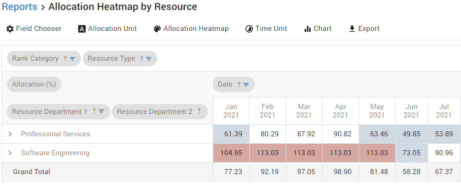
In the example above, you can see underallocations in your Professional Services department and, more crucially, you can see your Software Engineering department is overallocated from the start of the year through May.
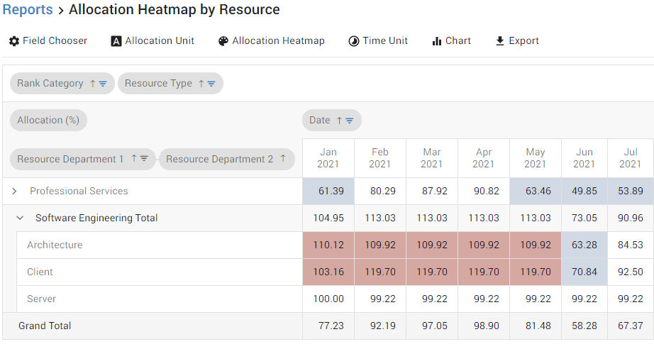
Drilling down further into the Software Engineering department, you can see that the overallocations are specifically related to the Architecture and Client sub-departments, while your Server sub-department is evenly allocated. Understanding exactly which sub-departments or teams are overallocated helps you determine exactly where additional resourcesResourceResources are all the people, places and things that you need to complete projects. The most important resource? Employees, of course! are needed or which projectsProjectA project is a time-limited undertaking with defined objectives and resources that delivers unique results and often includes complex tasks. will need to be changed so teams aren’t overbooked.
By Resource
Looking at resource utilization by examining teams or departments is a great way to get a bird’s eye view, but sometimes you need to answer capacity planningCapacity PlanningCapacity planning and management refers to the process of matching the “capacity supply” (employees, resources, skills, etc.) with the “capacity demands” (projects) of an organization. It is considered a part… questions at the individual level.
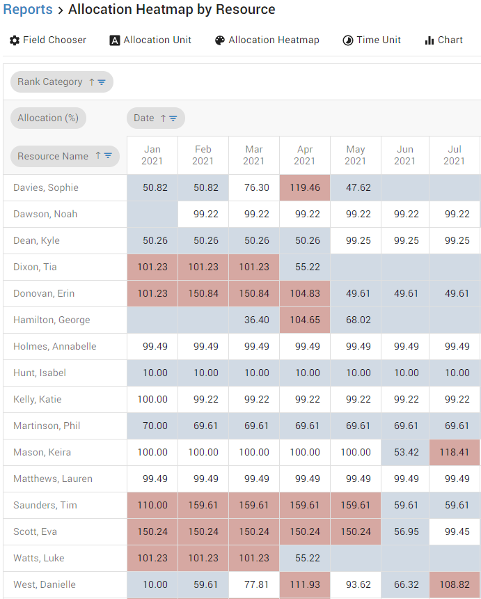
By sorting the allocation heatmap report by individual resourcesResourceResources are all the people, places and things that you need to complete projects. The most important resource? Employees, of course!, you quickly see who is assigned to too many projectsProjectA project is a time-limited undertaking with defined objectives and resources that delivers unique results and often includes complex tasks. and who is available. Resources like Phil Martinson are continually underallocated. Is this because there aren’t enough projects that require his skills or is it an oversight in planning? Resources like Eva Scott are regularly overallocated. Does this mean she is a key resource that has become a bottleneck? Are there other resources that can take some of the load? Answering questions like this before these conflicts become real problems can save time, money, frustration and projects.
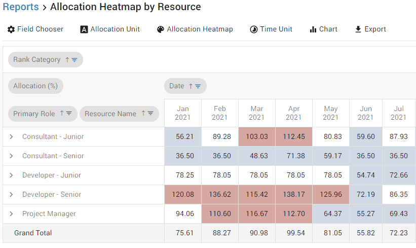
By Role
For organizations that use role-based planning, the allocation heatmap report can be configured to display role capacity.
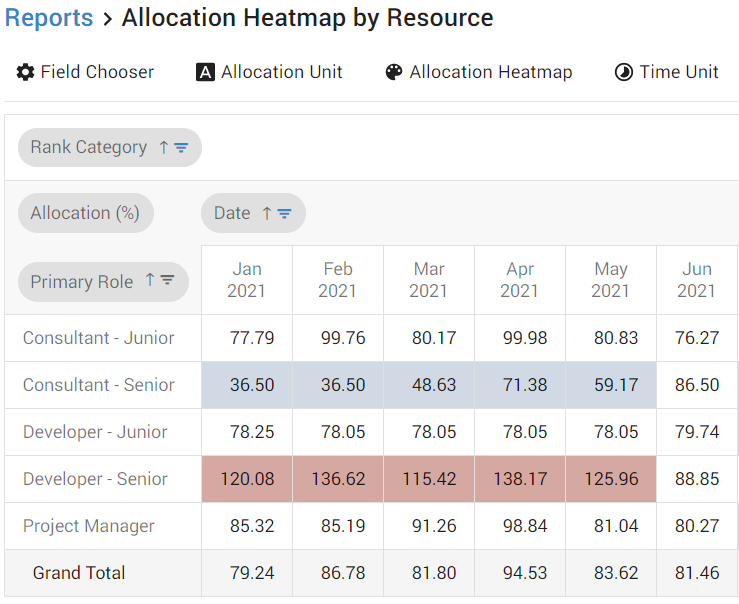
In the example above, you can see the Developer – Senior Role is overbooked and the Consultant – Senior is underbooked substantially in January through May. This can tell you a lot about the types of projectsProjectA project is a time-limited undertaking with defined objectives and resources that delivers unique results and often includes complex tasks. currently in your project portfolio. The balance of projects is currently skewed towards projects that need Senior Developers while leaving Senior Consultants with too few projects.
Start Using an Allocation Heatmap
Allocation heatmaps can take the headache out of resource planning and quickly answer resourceResourceResources are all the people, places and things that you need to complete projects. The most important resource? Employees, of course! questions. If you’d like to know more about our allocation heatmap report, you can visit our Help Center for a more in-depth look at the report. To try out the allocation heatmap yourself, you can start a free 30 day trial in Meisterplan.
Read Next
Emma Hanes

Emma Hanes is an Ohio native happy to call Houston her home. As a Content Development Manager, Emma works to answer customer questions through ...

Project Portfolio Management in a Winter Wonderland
Santa visits every year, and it’s always the ultimate planning challenge for him and his team. Anyone who thinks delivering gifts is easy has never tried to make two billion project sponsors happy in a single night — with individual requests, delivery times, and quality expectations. Welcome to the biggest project portfolio of the year!

Meisterplan Stands Out in the Vendor Selection Matrix™ 2025
Meisterplan is the leading Project Portfolio and Resource Management solution – ranked #1 in the independent Vendor Selection Matrix™ 2025 report. Users consistently praise its exceptional customer service and top-tier product quality.