What is a Gantt Chart?
A Gantt chart is a categorical list on a vertical (Y) axis mapped against time on a horizontal (X) axis and is used to visualize tasks or project plans into the future.
Gantt Diagramm:
Definition | Examples | Synonyms
The Gantt chart was originally devised by Polish engineer, Karol Adamiecki, and American engineer, Henry Gantt, independently. In project portfolio management (PPM), Gantt charts support the scheduling and monitoring of projects to help organizations make informed decisions about resource allocation and project priorities.
A Gantt chart maps each project against an ongoing timeline. How does a two-dimensional chart inform decision-making exactly?

A Practical Example
Imagine you work at a company that manufactures electronic equipment. Sounds simple, but your colleagues are likely working on a few different kinds of projects at any given time: research and development, order delivery, shifting production capacity from one product to another, rolling out a new HR software and presumably much more!
Each of these projects could be represented by a horizontal bar. One of the unique advantages of a Gantt chart, though, is the ability to group and categorize projects. For example, regularly occurring, run-the-business projects like order delivery or cyclical shifts in production capacity can be grouped together by being placed above the gray horizontal line in the left-hand sidebar.
Below the bar come one-off projects, like new product development and software integration. Product development and order delivery, with their focus on the product side of things, can both have the same color, let’s say yellow. HR software rollout is a department-specific project, so we can give it a unique color: green.
And just like that, you have all your projects organized by type, with start dates, end dates and department visible at glance.

Synonyms and Abbreviations
There are none.
FAQ
There are five main components needed to construct a Gantt chart:
- Project/task list: A list of things that you would like to achieve, listed vertically
- Duration: A timeframe in which you’d like to achieve them, modelled horizontally
- Milestones: Significant achievements or checkpoints that split up a project into phases
- Dependencies: The way projects interact and depend on one another
- Resource allocations: The resources needed for or allocated to the project; this influences duration and scheduling of the project
Without these five things, it’s not really possible to make a proper Gantt chart. Take a look at our deep dive into Gantt charts to find out more about these components.
A Gantt chart does three basic things:
- Serves as an index or catalogue of ongoing and/or planned projects for PMOs and other decision-makers
- Can be used as a rough roadmap to quickly and easily see how things are progressing
- Helps PMOs approximate project/portfolio progress and make informed decisions about future project intake.
Gantt charts are the MVP of project and portfolio management. The components that make up a Gantt chart (project list, duration, milestones, dependencies and resource allocations) make it a great tool for project scheduling.
Not only that, but you can add additional features to your Gantt chart to provide deeper portfolio insights. Grouping projects in your Gantt chart by their alignment to a specific strategic goal can, for example, help you figure out which goals you’re actively working towards and which goals have come out of focus.
A Gantt chart is a roadmap, but with even more detail. Where a roadmap provides an overview of project objectives, milestones, deliverables and resources, a Gantt chart displays all of these things mapped over time. Some people refer to Gantt charts as roadmaps, but if you see your projects and their components modelled against time, give credit to Henry Gantt!
A project timeline is a big-picture overview of a project that visually displays milestones and deadlines. A Gantt chart takes timelines for all of your projects and displays them side-by-side, helping you to view dependencies and get a feel for how they’re interrelated.
The Agile method of project planning emphasizes adaptability. It breaks up work into increments, called sprints, that typically last two weeks. By using a Gantt chart to model your projects and their due dates, you can accurately estimate how changes in the plan affect your work in current and future sprints.
Need a Gantt chart software?
Try Meisterplan.
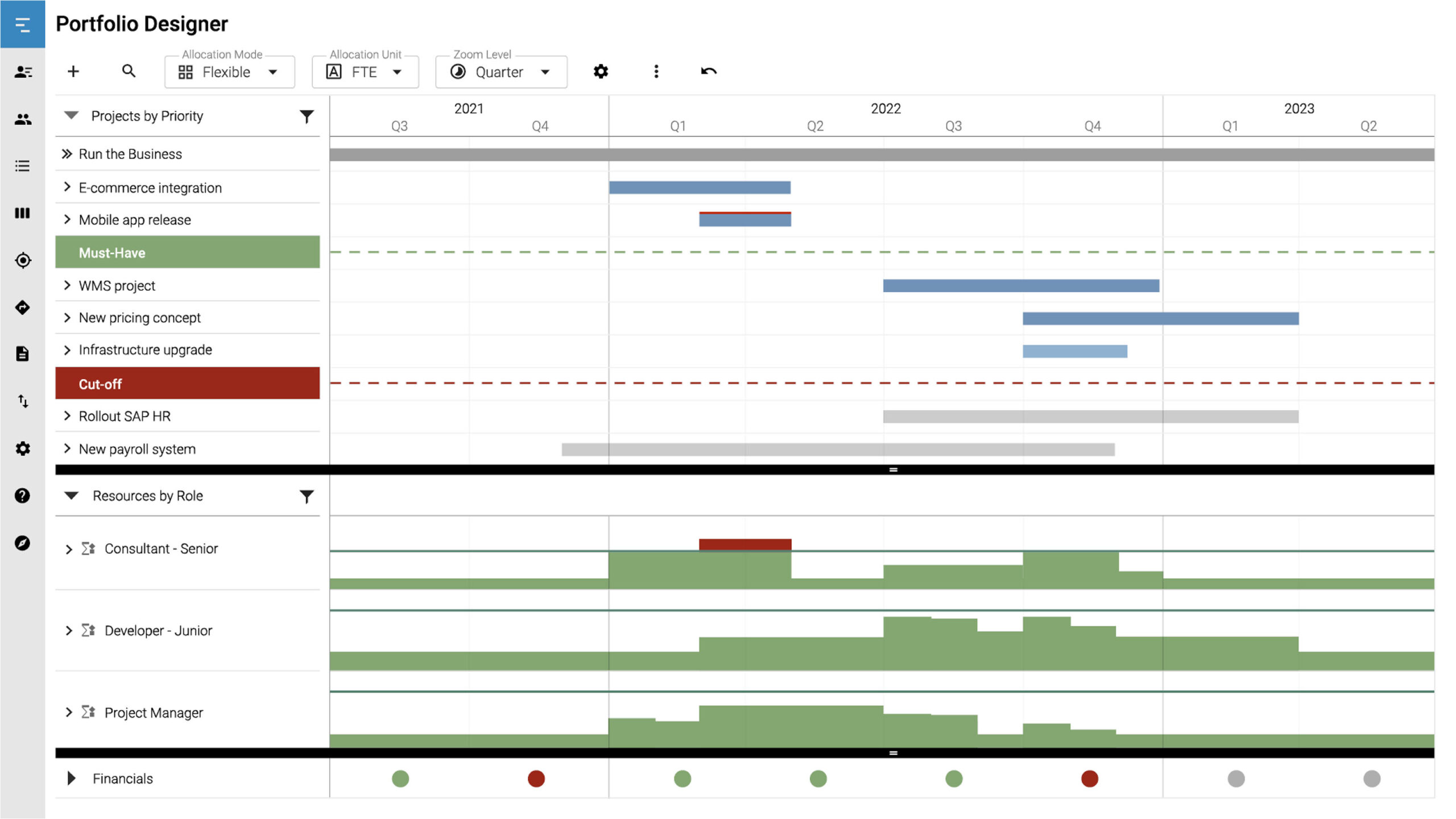
Meisterplan offers multiple views to give you a comprehensive overview of your entire project portfolio. For instance, the Portfolio Designer at the heart of our software builds off of a basic Gantt chart with drag-and-drop functionality that allows you to visualize your portfolio in real time.
Looking for a roadmap view? Meisterplan has got you covered there too! See your long-term strategic roadmap, including milestones and dependencies, and ensure your projects are aligned with your long-term goals.

Meisterplan is even easier to use than Excel. Automatically see the effects of rescheduling projects thanks to immediate visual feedback. Plus, thanks to our easy-to-use user interface, your colleagues don’t need to know VBA to get started.
But it’s still possible to import data for use in Meisterplan if that’s what your teams prefer. This means you can keep using Excel if you’d like, while also gaining access to Meisterplan’s other helpful features, like intuitive resource management and comprehensive reporting.
Discover More Here!
Dive even deeper into the topics of project, portfolio and resource management: Each page offers expert knowledge, product insights and a wealth of experience we'd like to share with you.

The Gantt Chart: Its Components, Uses and Benefits Explained

Aligning Projects to Corporate Goals with a Roadmap