

Everyone in your organization uses reports but not everyone needs the same information to get their job done. A NASA public relations manager doesn’t need to know the ins and outs of rocket fuel sourcing. Technical aspects of data security at NASA are not relevant to an engineer. These are just a few examples where data that is useful for one part of the organization is irrelevant for another. No matter your industry or organization size, different people need access to different types of insights to be successful within their role. Consequently, reports are not one size fits all.
What Type of Reports Do Decision-Makers Need?
Similar to a NASA engineer, decision-makers in an organization require their reports to highlight role-specific data and insights, which can differ greatly from the reports a PMO head uses. A PMO lead probably wants reports that show an overview of all projects within the portfolio — including metadata and milestones. They may want to see how allocations stack up to capacity and which teams are working on what. In this context, reports should be not so high level that they lose detail, but not so narrow that the PMO head misses the big picture. The level of detail should be somewhere in the middle.
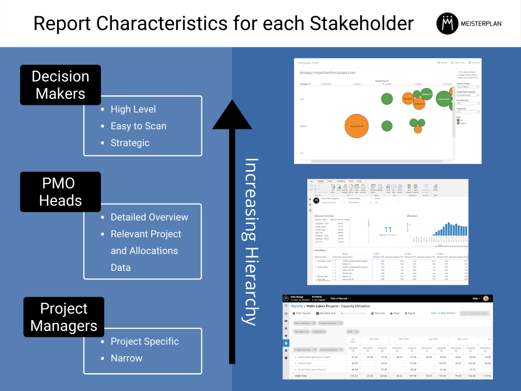
Reports for decision-makers, on the other hand, are most useful when they are high level, strategy orientated and easy to scan. Reports with these characteristics are robust enough to make big decisions but not so comprehensive that someone would get lost in the data. Keeping this in mind, below is a helpful list of Meisterplan reports that are beneficial for decision-makers.
Strategic Project Portfolio Bubble Chart – tableau
What Does it Report on?
- Overview of project payback period relative to strategy fit
- The risk level of your most labor-intensive projects
- The strategic makeup of your portfolio
How Do I Use It?
- Portfolio board meeting to discuss strategic alignment
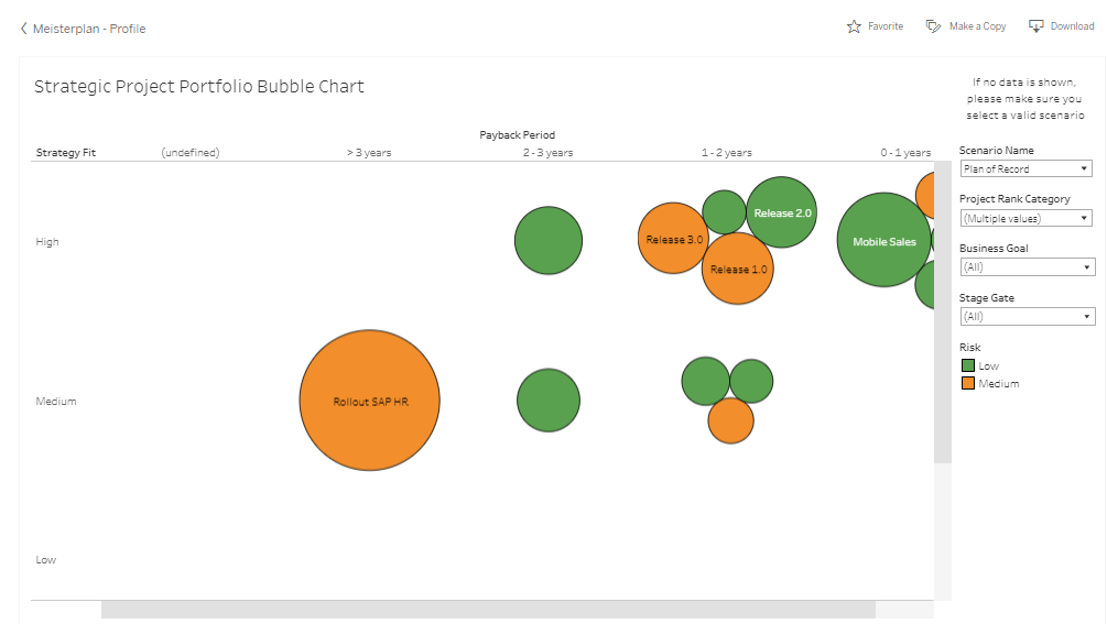
Who doesn’t love a good bubble chart? Simple, visually enticing, and straight to the point, bubble charts are a popular choice among business professionals looking to find trends among a grouping of items. The Strategic Project Portfolio Bubble Chart template can be downloaded from our tableau profile and reports on projects in respect to strategy, risk and when the organization can expect to reap the benefits of the project.
The position of each bubble indicates Strategy Fit and Payback Period, while the size illustrates the amount of work in days required to complete the project. The color of the bubble indicates the risk level. This report can be useful in several ways for decision-makers. They can easily understand the degree of goal alignment in the portfolio and how much effort it will take to achieve said goals. Because the bubbles are color-coded, decision-makers can quickly comprehend the risk make-up of the portfolio. The report also displays the project manager of each project, so concerns and questions can be addressed quickly.
Project Pipeline Analysis by Financial Value – tableau
What Does it Report on?
- Overview of portfolio finances
- Cost, benefit, and the net value of all projects
- Filter project finances by goal
How Do I Use It?
- Identify project “quick wins”
- Understand the financial implications of meeting a goal
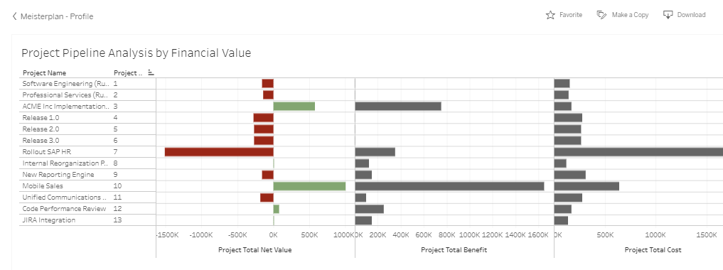
Not all financial reports require detailed number crunching. This report takes the fairly complex topic of project portfolio financial analysis (say that five times fast) and displays it in a visually appealing net value view. The Project Pipeline Analysis by Financial Value report is also a template that can be downloaded from our tableau profile. It reports on the costs, benefits and net value of each project and displays them in a column chart to easily compare finances across your portfolio.
Now, this report is not going to tell you an itemized list of anticipated expenses but will provide a clear overview of the portfolio’s planned finances, which is what decision-makers are looking for. With a quick scan, decision-makers can understand what projects in the pipeline will be incurring the most costs relative to benefits. They can also see which projects can be considered “quick wins”, with low costs and high benefits. Armed with this information, decision-makers can determine which projects are strategically most valuable to the overall portfolio. This report can also be filtered by Business Goal, allowing users to visualize the financial implications of meeting a target.
Portfolio Overview – Power Bi
What Does it Report on?
- Portfolio makeup by status, strategy fit, risk level, payback period, and business goal
- All project metadata
How Do I Use It?
- Quickly filter projects by specific status, strategy fit, risk level, payback period, or business goal
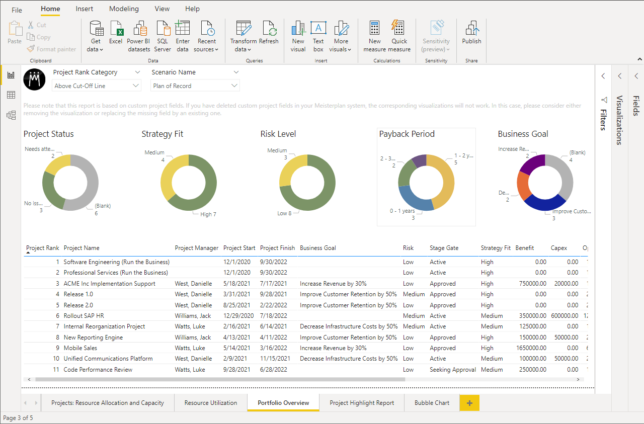
This report was added to this list due mostly to its lighting fast filtering capabilities and visual break down of portfolio characteristics. The Portfolio Overview is one of many visualization tabs hosted in a Power BI report template, available for download via our Help Center. The Portfolio Overview report displays relevant project characteristics (status, strategy fit, risk level, business goal, etc.) in donut shaped charts in addition to detailed project meta data below.
By clicking into, let’s say, the Low segment of the Risk Level donut chart, the table of projects below is immediately filtered by this dimension. Like the Resource Allocation and Capacity report (detailed in the next section), this report is handy for steering committee meetings when questions about the portfolio makeup are raised on the fly. Decision-makers can quickly see all the projects that will benefit the organization within a year or are working towards a specific goal (in addition to a number of other characteristics). This can help decision-makers understand the current composition of the portfolio and make recommendations for improvement. For example, a decision-maker may notice that the PMO has taken on less risky projects as of late that have a lower pay-off. They might recommend including a riskier project with a higher pay off in the portfolio to create balance.
Projects: Resource Allocation and Capacity – Power Bi
What Does it Report on?
- Project details, status, business goals, and allocations
How Do I Use It?
- Quickly answer project-specific questions in a steering committee meeting
- Filter for all projects working towards a particular goal
- Filter for and resolve all projects with a critical status
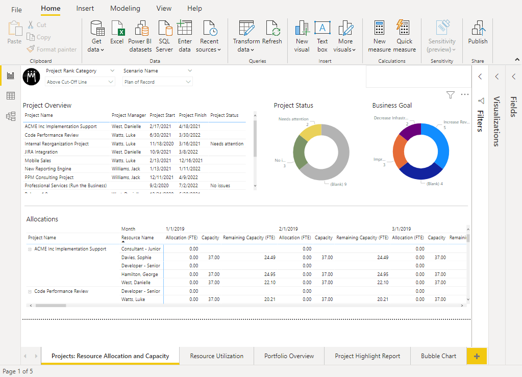
The Resource Allocation and Capacity report may look like it has a lot going on, but I promise it isn’t as complicated as it seems. With information on general project details, status, business goals, and allocations, this report covers a lot of bases. It is also available within a Power BI report template, found in our Help Center.
Unfortunately, this report is often overlooked by decision-makers because it can seem too resource management specific to benefit upper management. However, it can be informative to understand who is working on what project in the portfolio and why. The Business Goals donut at the top of the screen visualizes the breakdown of business goals by project. Clicking into the donut chart quickly filters the page by a specific business goal to better see the projects and resources working towards that goal. Questions raised in a steering committee meeting about a project’s status and allocated work can easily be addressed to keep decision-makers informed. While this report is not intended to be used by decision-makers on a daily basis, it is useful to see an overview of how the portfolio is being executed.
Capacity Utilization by Project – Integrated Pivot
What Does it Report on?
- Project allocations compared to available capacity
How Do I Use It?
- Understand where people are focusing their time
- How project allocations align to overall capacity
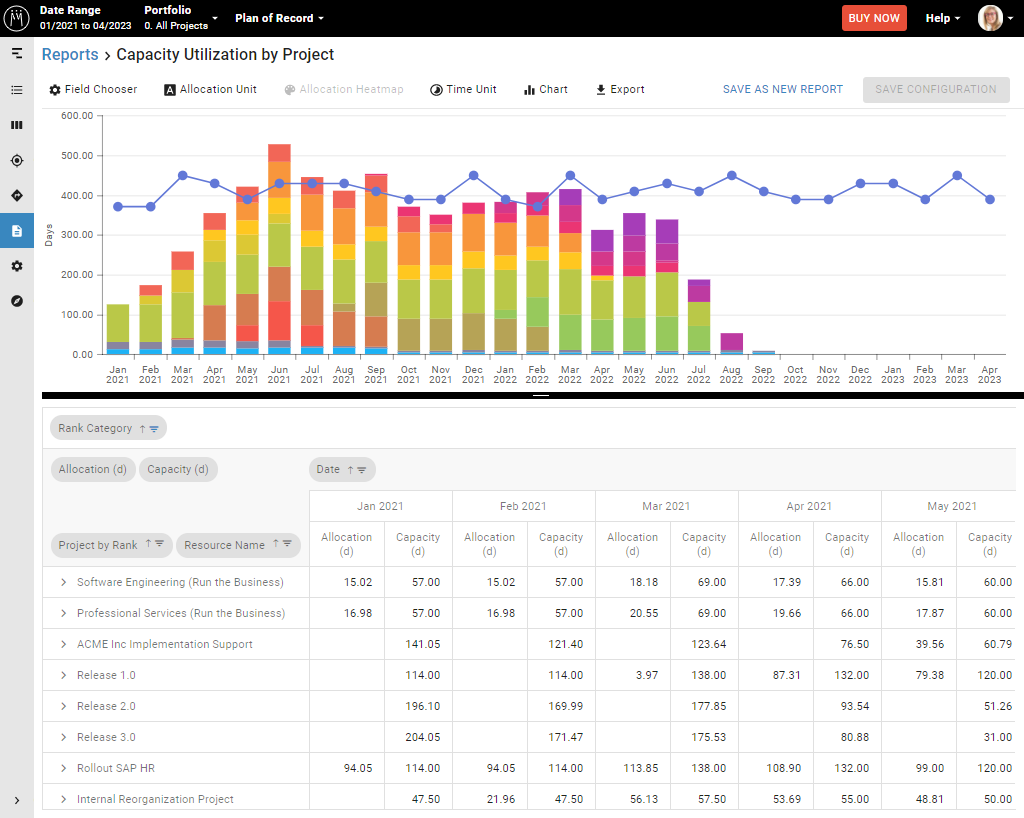
Last, but certainly not least, is the Capacity Utilization by Project report. Found in each Meisterplan instance, this template reports on the allocations associated to each project compared to available capacity. This report does not require a third-party license, so it is a popular choice for individuals just starting out with Meisterplan.
This report is similar to the Resource Allocation and Capacity report in respect to sheer detail. While there might be a little too much information for a decision-marker’s day to day use, the visual at the top of the report provides powerful information about what projects are being focused on for each month and how that aligns to the overall capacity. With this report, decision-makers can understand the progression of projects and where people are spending their time. This can help them decide if the portfolio is moving in the right direction for the business, or if future planning needs to put more focus on other projects.
Better Reporting with Meisterplan
Everyone in an organization needs different information — and consequently reports — to be successful. Decision-makers are no different. With these Meisterplan report templates, make it easy for decision-makers to draw conclusions and act on data. To learn how you can customize reports for decision-makers with Meisterplan, schedule a customized demo today!
Read Next
Kasey Babcock

A coffee drinker from an arguably young age, Kasey was a natural fit for our Seattle-based Meisterplan team. Before joining the marketing team, Kasey ...

Data Quality: The Achilles Heel of Project Portfolio Management