

No matter the industry, location or business, almost all organizations require some kind of reporting to understand performance. Additionally, this performance needs to properly communicated to those calling the shots, the decision-makers, so that they can take action based on these insights. This statement holds true in the world of project portfolio management. Without the ability to see the current status of work, upcoming projects and recently completed projects, portfolios coordinators and PMO directors would have serious difficulty planning a realistic project portfolio. A lack of reporting would also lead to weak communication with upper management. Without reports that condense detailed portfolio information into relevant business insights, decision-makers would not have the resources to make the best decisions for their business.
Communicate Your Meisterplan Data to Improve Decision Making
With this purpose in mind, we are pleased to announce four new Power BI report templates specifically designed to make it easier for portfolio coordinators to communicate their Meisterplan data. Use these templates so upper management can make decisions based on the strategic impacts of new initiatives, project status updates, capacity bottlenecks, and current and upcoming projects. Each of these templates can be downloaded via our Help Center, in addition to more information on how to configure each report. If you want to get started with our new Power BI report templates, here’s what you need to know about each one.
Want to learn more about what kinds of reports decision-makers find most useful? Check out our blog post “What Reports are Beneficial for Decision-Makers?” for a full list of report characteristics to look out for.
Capacity Analysis Report
What Does It Report On?
- Projects and their capacity requests that are seeking approval
- Overview of team members’ assigned projects and capacity
- Planned allocations vs. actuals
- Upcoming allocations vs. capacity
How Do I Use It?
- Communicate and address capacity bottlenecks that may jeopardize the success of projects
- Answer questions from upper management on where employee capacity is allocated
- Obtain a better understanding of the upcoming and current capacity makeup in your project portfolio
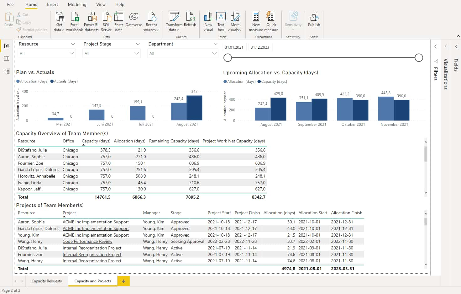
This report is the holy grail for anyone working closely with resource capacity or who needs to quickly resolve capacity bottlenecks in your project portfolio. The first tab in this report displays a simple chart of all upcoming capacity requests that have yet to be approved. This is great for anticipating what projects require capacity from your employees. The second tab provides an overview of all resource capacity. Here you can quickly see what work has already been done, what capacity has been planned for, and the difference between the two. You can also easily filter by projects to better understand where capacity is going.
Let’s say you noticed the month of September in the above screenshot is overallocated. You simply won’t have enough capacity to get all the work done and projects will most likely be delayed. To find out what projects are requesting allocations this month and who is overallocated, click on the bar chart with the month in question. The bottom charts are instantly filtered and now display the projects in execution and each resources’ remaining capacity for this month.
Completed, Current and Upcoming Report (CCU)
What Does It Report On?
- Project metadata of completed, current and upcoming projects
- Project data filtered by project manager, Organizational Breakdown Structure and stage gate
- Number of completed, current and upcoming projects in your current project portfolio
How Do I Use It?
- Quickly answer questions from upper management about the most relevant projects
- See what work is underway and what work will be kicking off soon
- Understand progress of the most important projects in your portfolio
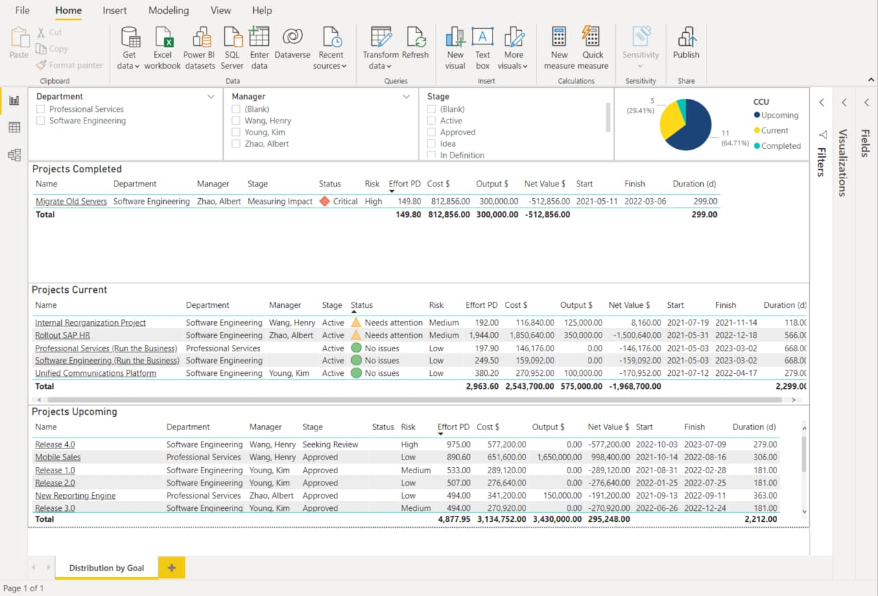
When managing a large project portfolio, it’s easy to get overwhelmed with the sheer mass of projects and resources. The truth is, it’s not necessary to see the whole portfolio all the time. There are many situations where portfolio coordinators and decision-makers alike would only need to see the projects that are relevant at that particular moment. This is where the CCU Report template comes in. The CCU report shows all the projects recently completed, currently in execution, and on the horizon along with important project details.
The four visuals at the top of the report allow for project filtering by Organizational Breakdown Structure, project manager, stage gate and CCU status. This is extremely valuable for quickly answering questions about what work was recently completed. Next time management wants an update on all the projects completed this quarter and their net value to the organization, you won’t come up empty-handed.
Pipeline Report
What Does It Report On?
- New initiatives and their financial impacts
- Breakdown of initiatives by strategy fit and risk
- Net value, risk and strategy fit of current projects
- Projects filtered by goal or Organizational Breakdown Structure
How Do I Use It?
- Illustrate to upper management how approved projects support the organization’s goals
- Understand upcoming projects in the pipeline to prepare for a pipeline review meeting
- Make decisions on what initiatives will be approved for execution
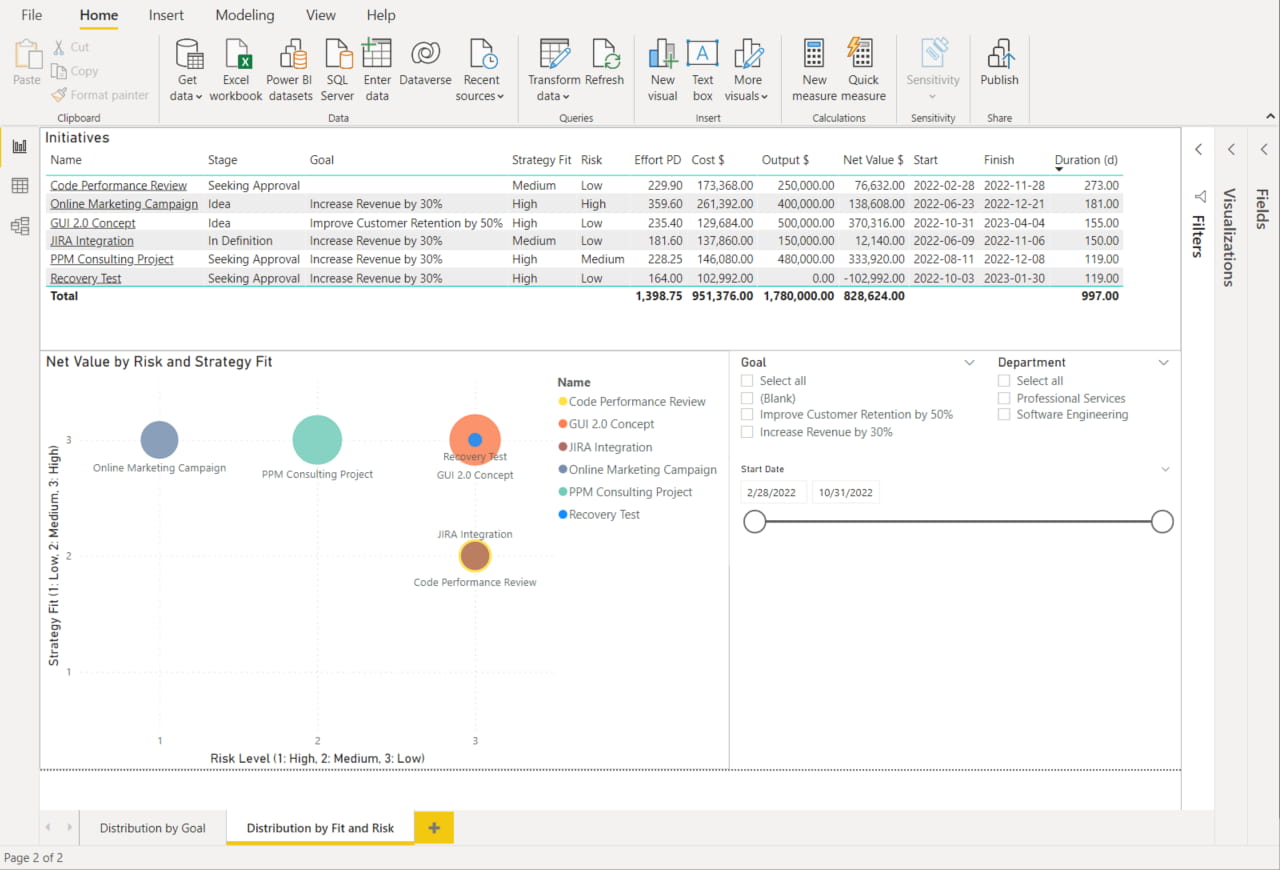
The Pipeline Report does exactly what it sounds like – reports on the projects in the pipeline. That seems fairly mundane but what makes this view unique is how it shows initiatives in terms of business goal, strategy fit, and project risk. Make strategic decisions with ease and ensure the projects being approved by the portfolio board matches the goals the organization wants to achieve.
The first tab in this report titled “Distribution by Goal”, does a great job of visualizing initiatives by strategic goal. See how initiatives and their goals stack up to risk levels in the bottom right corner. Quickly visualize the distribution of allocations and costs for the project goals in the pipeline. The second tab in the report, “Distribution by Fit and Risk”, features a bubble chart where the position of each bubble indicates Risk and Strategy Fit. The size illustrates the Net Value of the initiative. Filtering is made easy with the selections to the right.
Status Report
What Does It Report On?
- Project statuses and conflicts within your portfolio
- Overbooking on each project
- Heat map of your resource allocations per month
- Complete overview of the project portfolio including upcoming milestones, projects that need attention, milestones achieved, and actual time worked
How Do I Use It?
- Communicate to decisions-makers the current status of the portfolio
- Prepare for the next portfolio board meeting
Communication is arguably one of the most important factors in your organization’s success, which is why this report is so crucial. With the Status Report, portfolio coordinators can better communicate decisions made by the portfolio board or other decision-making body to the rest of the organization. But because communication is a two-way street, this view also helps the decision-makers take action according to what’s happening at the project level.
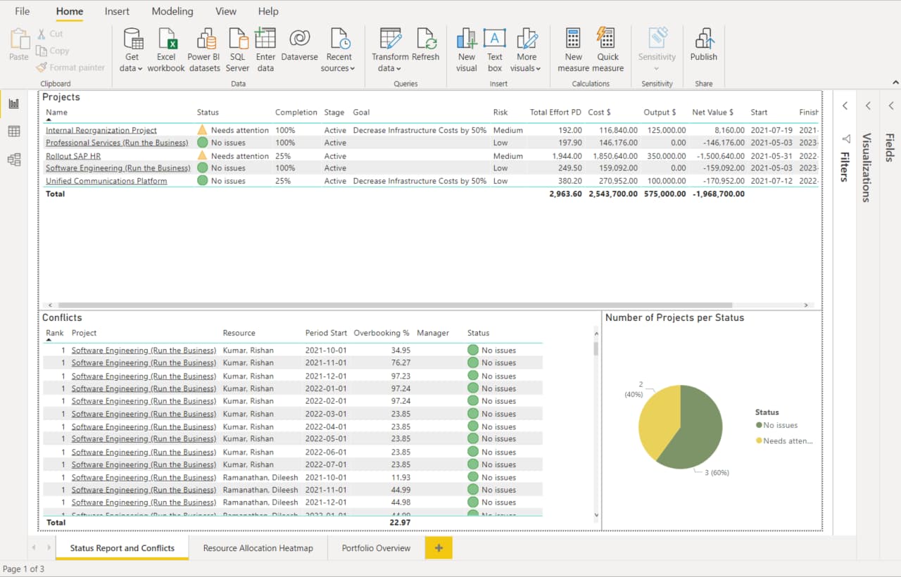
The report is broken up into three views that cover different topics you may want to know before a portfolio board meeting. The first tab in the report focuses on any conflicts that may have recently arisen between projects. Each conflict, related resource overbooking %, and project status are listed at the bottom of the view. Project status is also displayed in a pie chart for easy scanning. The second tab, “Resource Allocation Heat Map”, makes it easy to spot instances where employees have been assigned too much work. The last tab, “Portfolio Overview”, is a great dashboard for understanding what projects need attention, what has been achieved and what will be achieved soon. There is quite a bit of information on this page, but the most useful piece is probably the list of completed and upcoming milestones. This makes it easy to inform the portfolio board and upper management on how the project portfolio is performing.
Streamline your Project Portfolio with Meisterplan Reporting
Like what you see? Meisterplan offers a full range of reports and integrations to help your organization visualize portfolio information and make better decisions. To learn more about Meisterplan and all our reporting options, schedule a customized demo today!
Read Next
Kasey Babcock

A coffee drinker from an arguably young age, Kasey was a natural fit for our Seattle-based Meisterplan team. Before joining the marketing team, Kasey ...

How to Harness the Power of Your Team from Any Seat!