Leading Companies Trust Meisterplan
Different Ways to Display Your Data
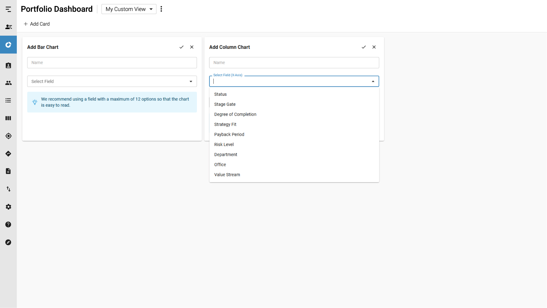
With the Portfolio Dashboard, you can visualize your portfolio’s KPIs in a variety of ways with just a few clicks. Choose from a variety of visualizations so that you have what is most meaningful for you.
- Bubble, Bar, Doughnut and Column Charts provide dynamic interpretations of your data.
- KPI cards allow you to have your most important figures quickly at hand.
- Lists of Milestones display what the most important dates in your portfolio are.
Easily Optimize Your View
Customize your Portfolio Dashboard to only see the most relevant data, with options to adjust your configuration and share with stakeholders.
- Add additional parameters to your charts, such as optional second values, to create the level of detail you need.
- Ensure clarity by adding, deleting and filtering cards.
- Organize your data using filters and simple drag-and-drop functionality.
Customized, In-Depth Reporting
The Portfolio Dashboard’s many options for displaying data allow you to make an in-app report that is all your own. With a wide variety of metrics from your portfolio at your fingertips, you’re only seconds from exactly the information you need.
- Easily share your dashboard configurations with others using Custom Views.
- Click on a section of a chart to quickly open a list of the relevant projects and navigate to the Project Details from there.
- Know when action needs to be taken and what requires attention.


